# @title
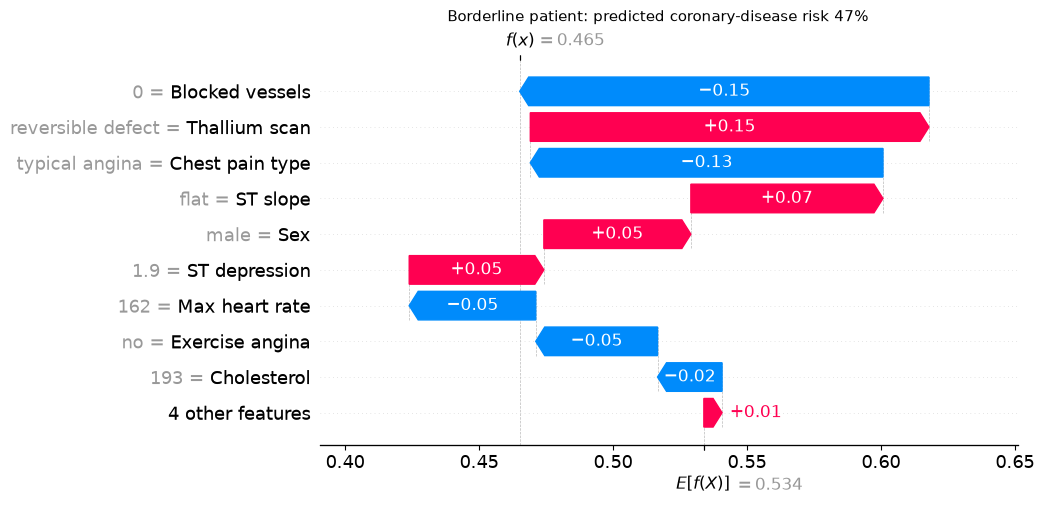
RENAME = {
    "age": "Age",
    "sex": "Sex",
    "chest": "Chest pain type",
    "resting_blood_pressure": "Resting BP",
    "serum_cholestoral": "Cholesterol",
    "fasting_blood_sugar": "High fasting sugar",
    "resting_electrocardiographic_results": "Resting ECG",
    "maximum_heart_rate_achieved": "Max heart rate",
    "exercise_induced_angina": "Exercise angina",
    "oldpeak": "ST depression",
    "slope": "ST slope",
    "number_of_major_vessels": "Blocked vessels",
    "thal": "Thallium scan",
}
DECODE = {
    "Sex": {0: "female", 1: "male"},
    "Chest pain type": {1: "typical angina", 2: "atypical angina", 3: "non-anginal", 4: "asymptomatic"},
    "High fasting sugar": {0: "no", 1: "yes"},
    "Resting ECG": {0: "normal", 1: "ST-T abnormality", 2: "LV hypertrophy"},
    "Exercise angina": {0: "no", 1: "yes"},
    "ST slope": {1: "upsloping", 2: "flat", 3: "downsloping"},
    "Thallium scan": {3: "normal", 6: "fixed defect", 7: "reversible defect"},
}
CATEGORICAL = ["Sex", "Chest pain type", "High fasting sugar", "Resting ECG",
               "Exercise angina", "ST slope", "Thallium scan"]
CONTINUOUS = ["Age", "Resting BP", "Cholesterol", "Max heart rate", "ST depression", "Blocked vessels"]