
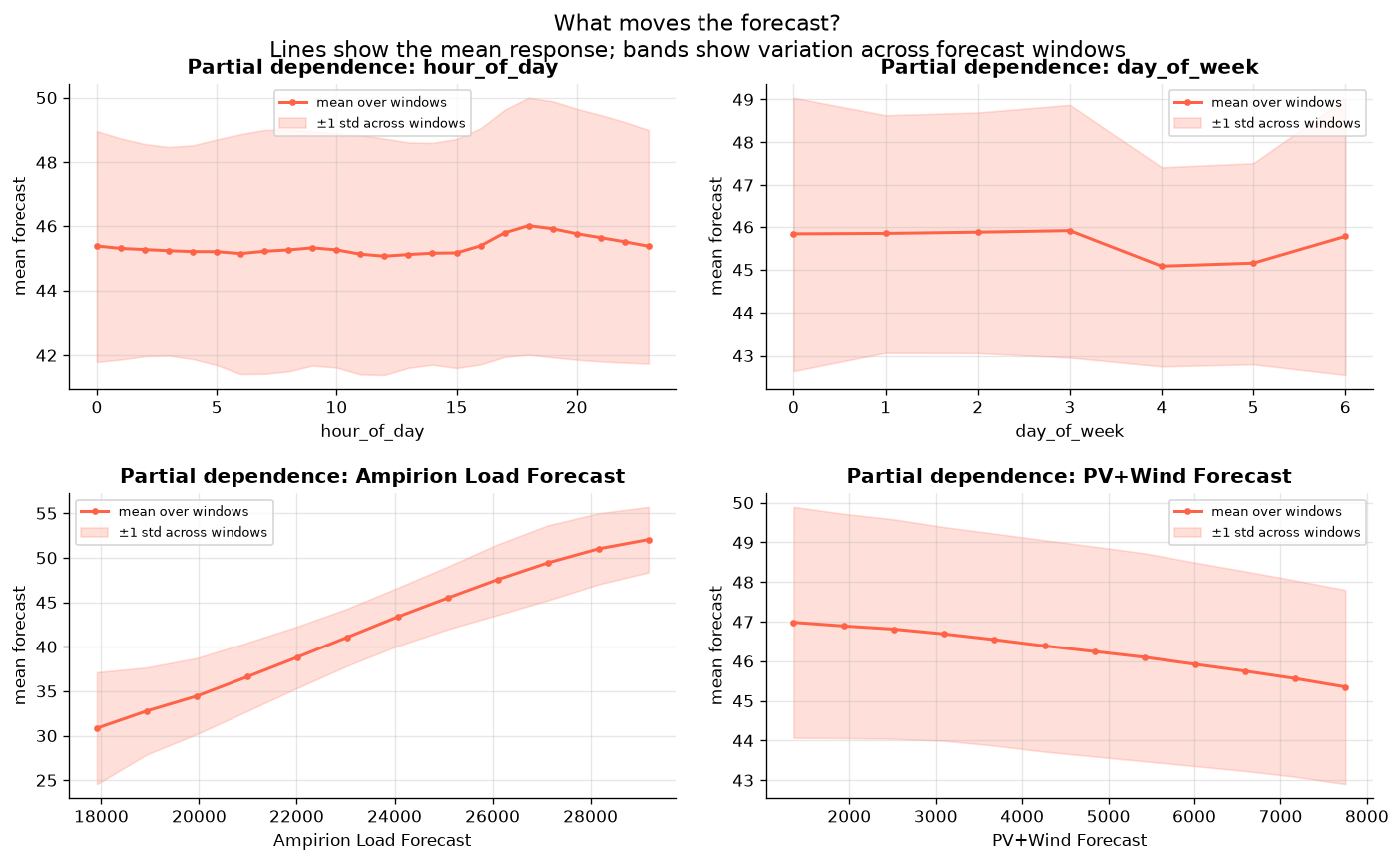
- Partial Dependence Plots: to understand how the forecast reacts to different feature values
- Window SHAP: SHAP values of different features and feature groups over time
- Series Decomposition: plotting the different components (trend, seasonality and residuals) of the series
Setup
Installing TabPFN-TS with its optional explainability tools. The explainability extra includesshapiq for grouped Shapley values and Matplotlib for the plotting helpers. pyarrow is used to read the compact Parquet dataset.
Loading the Data
Two weeks of hourly German electricity prices, demand, and renewable generation. The target is the German day-ahead electricity price. We use both time-based features computed automatically by theTabPFNTSPipeline and two known covariates: Amprion’s load to model demand and combined photovoltaic and wind forecast to model supply.
Visualising the series
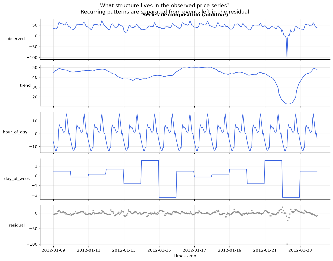
We start by plotting the data. We can see seasonal patterns with some shocks, including a negative price event.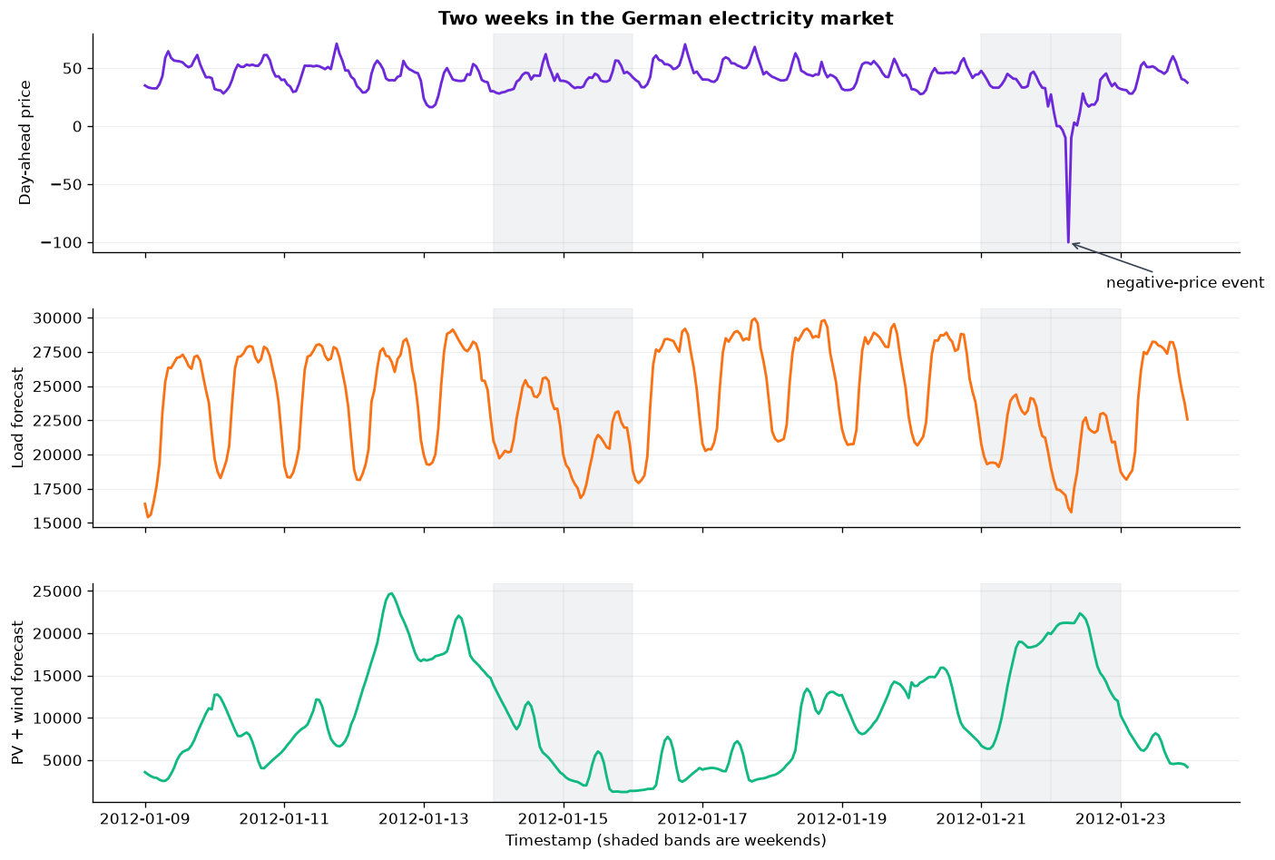
Fit and Forecast
Holding out the final day so the forecast can be seen against reality. TabPFN-TS turns the series into a tabular regression problem using calendar, trend, and automatically detected seasonal features. We give it seven days of context and the future load and renewables forecasts, then predict the final 24 hours.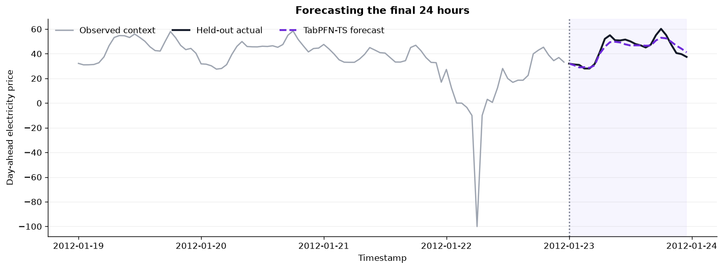
Partial Dependence
How the average forecast changes as one input moves. To better understand how the model responds to changes in its features, we built a specific time-series Partial Dependence Plot. We plot the average forecast value over several forecast windows as we change one of the feature values. We make sure to keep calendar features in the time domain (hour_of_day) from 0 to 23, to better understand their impact on the target variable.
Looking at the exogenous variables (Amprion’s load and PV+Wind forecasts), we see the relationships that we expect. Higher demand leads to higher prices. Higher supply is associated with lower prices.
Window SHAP
A feature-by-time map of what pushed each forecast up or down. The above plots are nice, but they do not tell us what drove the forecast on a given day. To do so, we implemented a Window SHAP that shows SHAP values of different features and feature groups for several time windows. This may remind you of a spectrogram. The blue cells push the value down, and the red cells push the value up. For example, on the 21st of January, the Amprion Load forecast pushed the forecast value down significantly. Here again, we made sure to keep calendar columns in the time domain instead of using raw Fourier-based encodings.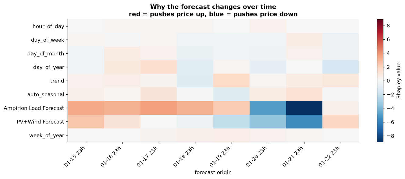
Which groups matter most overall?
Ranking the same attributions by average absolute contribution. Beyond direction, we can also calculate the magnitude of the SHAP values for each feature over the different time windows. This answers the question: which feature groups had the largest influence across all inspected windows?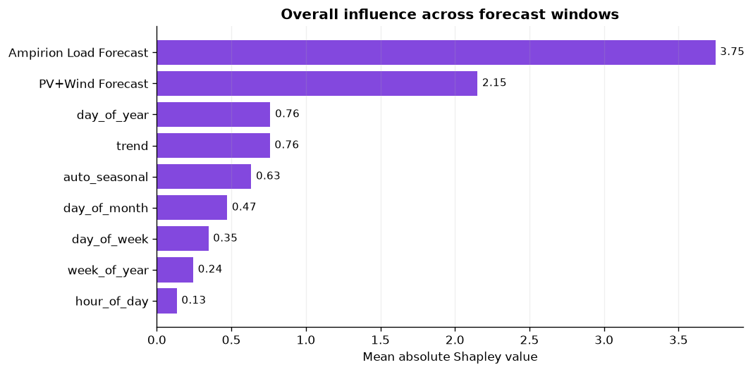
Decomposing the Observed Series
Separating trend, daily rhythm, weekly rhythm, and surprises. The previous tools interpret model predictions. Decomposition is a model-free description of the target. It is built using an additive formulation:observed = trend + hour_of_day + day_of_week + residual
This is particularly useful for time-series to better understand the underlying structure of a signal.
Reading the Explanations Together
Each view answers a different question.- Partial dependence shows the average response shape for one input at a time.
- Window SHAP shows which feature groups push forecasts up or down, and when their influence changes.
- Decomposition shows the recurring structure and exceptional events in the observed target.