TabPFNRegressor returns a full probability distribution over the target in a single forward pass, with no extra inference cost. The default .predict(X) call returns the distribution mean for scikit-learn compatibility, but the full distribution is always available through .predict(X, output_type="full").
Most models return only a single number per prediction. This hides everything about how confident the model is, whether the uncertainty is symmetric, and whether the target might have two plausible values instead of one. The full predictive distribution exposes all of it.
The full distribution lets you:
- Build calibrated prediction intervals from the model’s own quantiles.
- Detect skew, heavy tails, and multimodality that a point estimate hides.
- Pick the point estimate (mean, median, mode) that matches your loss function.
- Plot the per-sample density to inspect or communicate uncertainty.
Getting the full distribution
Setoutput_type="full" to get the raw distribution alongside all point estimates:
output_type values are convenience shortcuts that all derive from the same distribution:
output_type="full" requires the local tabpfn package. The cloud client (tabpfn-client) does not return raw logits. Use output_type="main" or output_type="quantiles" there instead.Point estimates
All three point estimates are derived from the same(logits, criterion) pair:
- Mean
- Median
- Mode
The probability-weighted average over bucket midpoints. Under squared loss this is the optimal point estimate given the model’s learned distribution, but if the distribution is bimodal, the mean falls between modes and may be a low-probability outcome. Use the full distribution or median when multimodality is likely.You can also compute it manually from the full output:
Use Cases
Quantiles and credible intervals
Passoutput_type="quantiles" with a quantiles list, or compute them directly from the bar distribution’s inverse CDF:
icdf method inverts the piecewise-uniform CDF exactly within the model’s bucket grid, so intervals are calibrated under the model’s distribution. Empirical calibration on held-out data is still recommended before relying on these intervals in production.
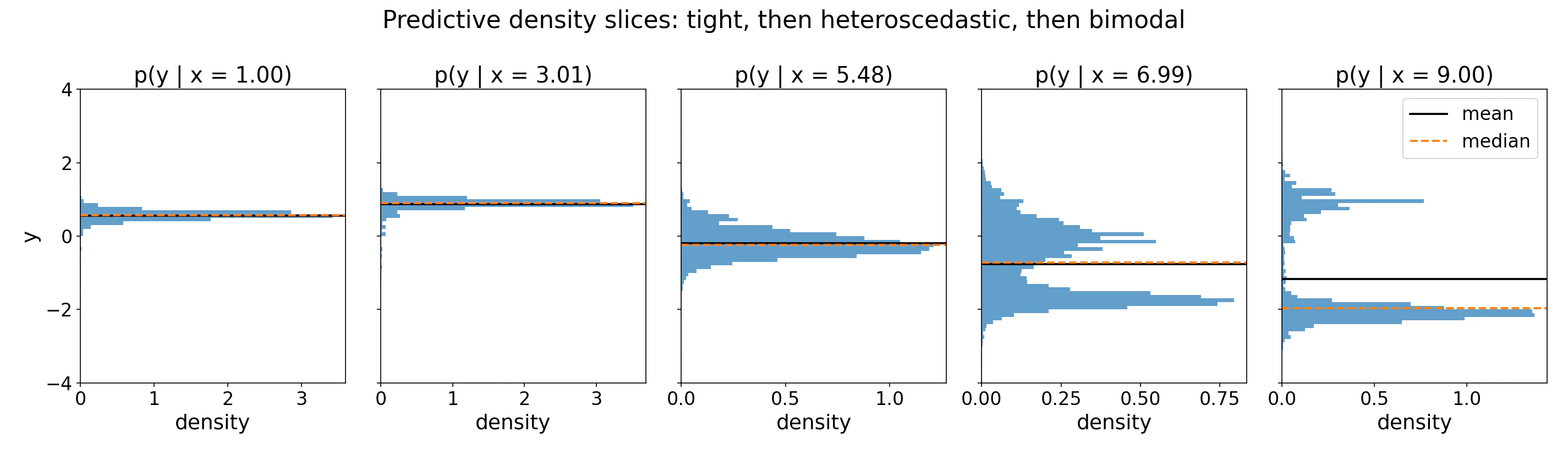
Single-sample plots
The coretabpfn package can draw the full predictive density for single test points. The helper renders the density as a curve, marks the mean, median, and mode, and shades a central credible interval.
output_type="full" dict directly and selects which row to plot with sample_idx; see plot_regression_distribution below for all arguments. Because it accepts an ax, you can lay several panels side by side to compare test points in one figure:
Plotting requires the optional matplotlib extra:
pip install "tabpfn[viz]".examples/plot_regression_distribution.py.
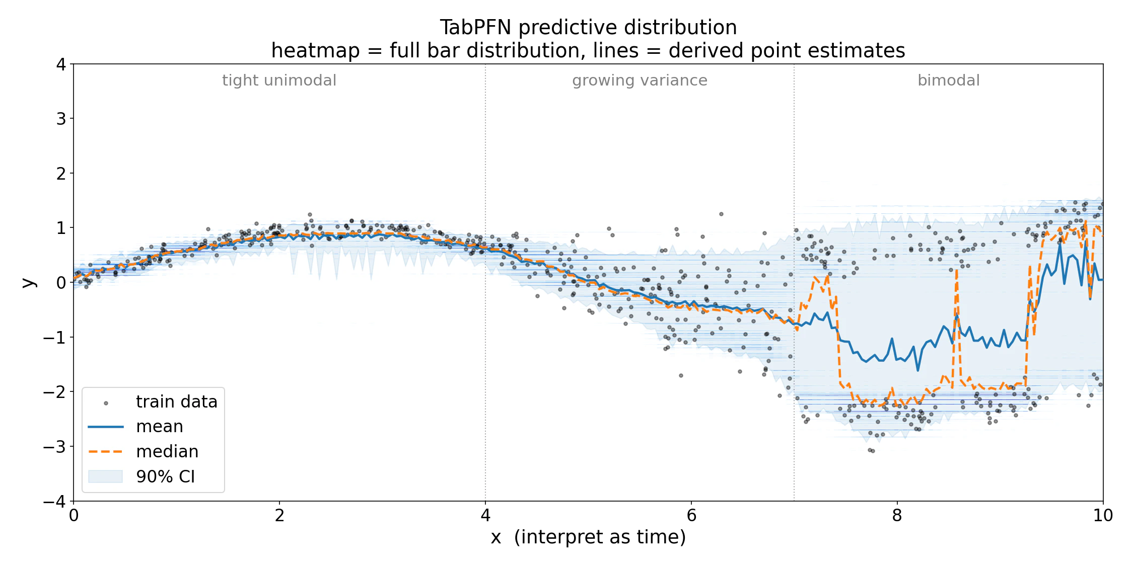
Visualizing many points at once
For comparing many test points at once, thebar_distribution_plot.py example helper in tabpfn-extensions renders the per-sample predictive density as a vertical heatmap. It is a standalone example file, so copy bar_distribution_plot.py into your project and import it locally:
X_test[:, 0] is the first feature column, used here as the x-axis for plotting. Replace it with whichever 1D value makes sense as a horizontal axis for your data. See plot_bar_distribution below for the merging, cropping, and palette options.
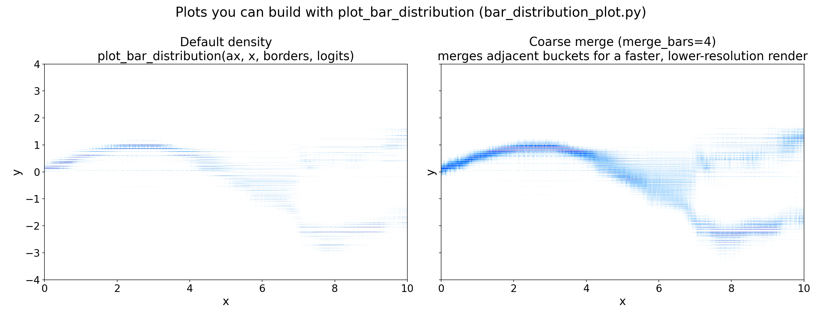
merge_bars=4, merging adjacent buckets for a coarser but faster render. Use the coarser view during exploration and the full-resolution view for final figures.
The full runnable example is at examples/predictive_distribution/predictive_distribution_example.py.
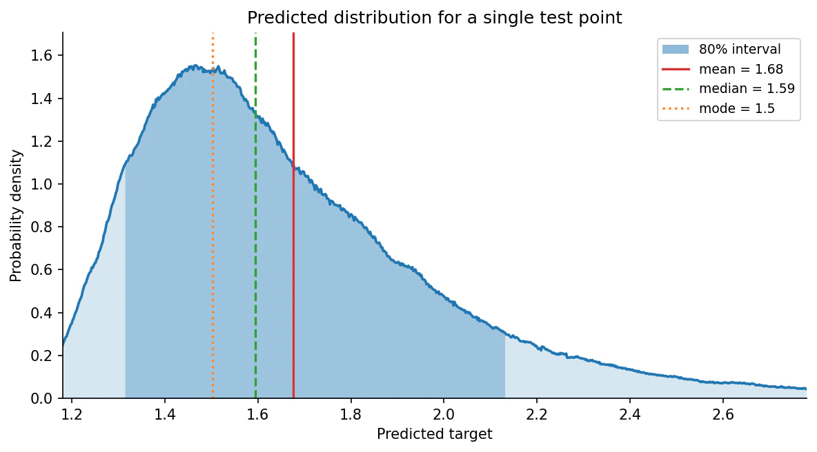
What is the bar distribution?
TabPFN treats regression as classification over a grid of buckets on the target axis. The model outputs one logit per bucket; a softmax converts these to bucket probabilities, and within each bucket the density is uniform. The result is a piecewise-uniform probability density overy:
With the logits.
Buckets are non-uniform: they are packed densely near the bulk of the training targets and spread into long tails. The model can therefore represent skewed, multimodal, or heteroscedastic targets with no parametric assumptions.
You do not need to fully understand the formula above to use TabPFN’s predicted regression distribution. All you need to remember is that TabPFN can output a distribution instead of a single point-estimate.
How the bucket borders are determined
The bucket borders are not fitted to your dataset. They are quantile-based bins fixed on TabPFN’s synthetic prior before pretraining, in a standardized (z-normalized) space, and never change afterwards. At inference time they are simply rescaled to your target’s mean and standard deviation, which is whypreds["criterion"].borders looks dataset-specific.
The regressor keeps two BarDistribution objects for this:
znorm_space_bardist_— the distribution (and its borders) computed on the prior before pretraining, in standardized space. Fixed for the model.raw_space_bardist_— the same distribution rescaled to your data’s mean and std at prediction time, in the target space you see.
get_bucket_limit, which computes quantile bins over the synthetic prior at training time.
Library Reference
tabpfn.visualisation.plot_regression_distribution
Plot the predicted target distribution for a single sample as a density curve, marking point estimates and shading a central credible interval. Requires the matplotlib extra (pip install "tabpfn[viz]"). All arguments after prediction are keyword-only.
Returns:
matplotlib.axes.Axes — the axes containing the plot.
bar_distribution_plot.plot_bar_distribution
Plot TabPFN’s per-sample bar distribution as a vertical heatmap, one column per test point. This is an example helper from tabpfn-extensions (copy it into your project); it depends on seaborn for its default palette.
Returns:
None — draws the heatmap onto the supplied ax.
Summary
The bar distribution gives you everything a point estimate discards: shape, skew, multimodality, and calibrated uncertainty. Useoutput_type="mean" when you need scikit-learn compatibility, output_type="quantiles" when you need intervals, and output_type="full" when you want to inspect or plot the distribution directly. For inputs well outside the training range, treat the distribution with caution: bucket boundaries are fixed at training time and the model does not flag OOD inputs automatically.
Regression
Point estimates, quantiles, and full distribution overview.
Interpretability
Explain predictions with Shapley values.
Metric Tuning
Optimize predictions for custom loss functions.
FAQ
Common questions and troubleshooting.